Lab 1: Bike Sharing
OIDD 2450 Tambe
1. Project background
GOAL: To familiarize yourself with Tableau as a tool for data analysis and visualization.
An important application area for big data analysis is transportation and logistics systems.
- One of the original big data systems was SABRE which handles airline scheduling.
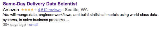
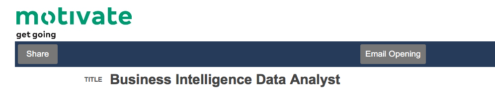
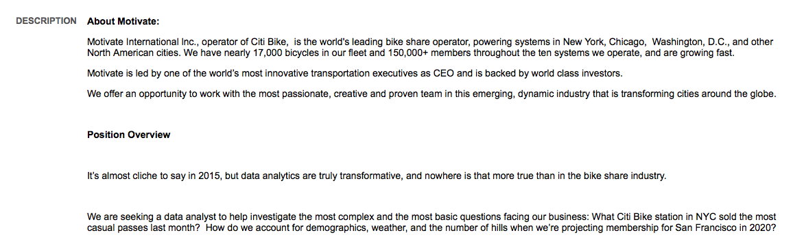
Some of the largest data science investments are in the transport and logistics industries: e.g. Uber, Lyft, FedEx, & Amazon. A sample job listing from this industry:

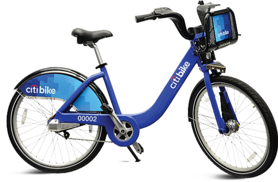
Citi Bike has been a controversial initative that has faced operational issues such as:
Data can be useful for addressing these issues. And Citi Bike affiliate Motivate has been analyzing data in this area! (Motivate has since been acquired by Lyft)
2. The Citi Bike data
Monthly Citi Bike usage data are available here. The data are organized as a series of CSV files. Excel, Access, Tableau and other popular data packages can automatically deal with data in .csv formats.
Begin by working with the ridership files from Oct 2019 and Oct 2020 from the link above. If your computer struggles with the larger files, I have generated smaller version of these files to make them slightly easier and quicker to work with. Data files for this session:
- There is a 500,000 row, 95 MB extract of the Oct 2019 ridership data.
- There is a 500,000 row, 95 MB extract of the Oct 2020 ridership data.
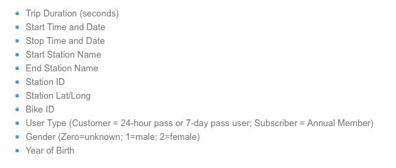
Take note of the data dictionary for the operational data collected by Citi Bike. Please note the coding for gender (0/1/2) and subscriber type!
3. Lab Objectives and Deliverables
Guidelines for deliverables:
- Submit your lab through the Canvas site.
- Create a document (e.g. using MS Word, MS Powerpoint, or equivalents) that includes the answers to the four questions below as well as any charts or visualizations needed to support your answer. You can “Export” charts from Tableau to include in your submission. If you have trouble with the export process, you can also take a screenshot and import it into a document. Your final document should include charts and answers for parts A, B, C, and D.
- Your final submission should be a .pdf. Please convert your documents to .pdf before submitting.
- There are several ways you can answer each question. Use your imagination to judge how to use the data to uncover a relationship or support an argument. It is important that your submissions be well organized and that your charts be clear, readable, and well labeled. Part of what makes tools like Tableau valuable is that it allows you to not only efficiently generate visual summaries of data, but also to make them attractive.
- You are encouraged to work with others, but it is not a team project. You are welcome to work in groups, but everyone should do the lab themselves and complete their own submissions. One submission is required per person (not one per team!) , should include only your original work, and must be uploaded by the deadline, which is listed on the Canvas assignment submission page. Please include on your submission the names of any people with whom you worked.
A. Create charts describing gender and Citi Bike usage
A key business imperative for sharing ride-sharing companies is having a broad demographic customer base. For example, SF has said that it will limit permits for scooter sharing companies unless they become more inclusive, by gender and race. For Citi Bike usage in the 2019 data file, create visualizations illustrating how women differ from men along the following four dimensions. For the choice of visualization, you should use your best judgment as to what most clearly illustrates the comparison. Please drop (e.g. filter out) the "unknown" category in gender.
- Fraction of total bike rides taken.
- Total time utilization of bikes by day of week (i.e. Monday, Tuesday …). This requires the
trip durationof bikes are used, not how many times they are used. You can compare either total or averaged trip duration.
- Hour of day bikes are checked out.
- The locations of the stations at which the bikes are picked up.
B. Build a “data product” that advises decision-makers on how to improve gender balance for Citi Bike.
The COVID-19 related changes to city life created a natural experiment that appear to have increased gender balance in the Citi Bike network. This provides an opportunity to derive insights into policies that could shift gender balance in service usage on a more long-term basis.
- By comparing the aggregate activity in the October 2019 and October 2020 data sets, provide visual evidence on the extent of this shift in usage by gender. You do not need to combine the data sets for this exercise, you can analyze each month separately and conduct a visual comparison of any charts you make for the two different months.
- Using the more detailed activity data, provide evidence for an actionable recommendation as to changes that either policy makers (e.g. NYC local government) or Citibike managers can make to ensure this shift persists after a return to normal. Alternatively, you can choose to provide evidence that you believe that this shift is likely to be only temporary and that no investments should be made. In either case, generate a visualization or a set of visualizations from the data that tells a story to Citi Bike decision makers about what might be driving these changes. To do this, you will need to go beyond using the aggregate data, and examine shifts in gender usage in the two different time periods by location, time, age, or other attributes. Examples of investments you suggest could be adding new features to the bike or stations or roads. Be as creative as you like but your recommendation should be evidence-based. The data are unlikely to provide iron-clad evidence for any intervention, but they should support it.
- Provide a brief description (no more than a paragraph) describing your visualization and what it suggests. (As you work on this exercise, consider how large data sets such as these may be shifting decision-making behaviors inside organizations, setting up a battle between the intuition of experts and the analyses produced by data scientists. This will be a recurring theme in this course.)
- It is important that this exercise provide a sharp recommendation or answer to the above question. For instance, if your suggestion is how to improve the product or service, you should suggest a specific improvement to their roads or bikes or pricing, based on the data you can analyze.
C. Data-driven operations: The case of Lyft
Towards the end of 2018, Lyft made an approximately $100 million investment into Citi Bike. Citi Bike planned to use this money to add thousands of bikes to their network. Some of these were to be e-assist bikes that are electrically boosted and will allow for "range expansion", which means that it will allow riders to bike longer distances more easily.
- Imagine they plan to kick off this initiative by targeting the placement of their e-bikes to stations that have users with the longest trip durations. Using the October 2019 data, create a map indicating which stations should be targeted.
- Citi Bike currently does not allow its bicycles to be taken on the NYC subway trains. Their bicycles, and especially their electric bikes, are also extremely heavy, making it difficult to move them around. Suppose Citi Bike changes their policy to allow customers to take electric bikes on the subway train to further encourage range expansion, but they need to understand where these bikes can be easily rolled into and out of stations. Using data on NYC subway station locations, create a map of subway station locations in the city, where stations are color coded by whether the stations are "e-Bike accessible".
- Please note, for this part, you only need to use the data on NYC subway station locations. You do not need to connect it to the Citi Bike data or otherwise use the Citi Bike data in any way, so you can remove that data source from your workspace. The data needed for creating such a measure from the subway data are contained in the
Entrance Typefield.
- To create two categories out of the many different types of entrances in this field, use the
GROUPfunction under Create (in the options when you click the down arrow next to the variable name), generate a new grouped variable which takes the value "e-Bike Accessible" for stations where the entrance is an elevator, ramp, or walkway and has the value "Not e-Bike Accessible" for other entrance types.
- Please note, for this part, you only need to use the data on NYC subway station locations. You do not need to connect it to the Citi Bike data or otherwise use the Citi Bike data in any way, so you can remove that data source from your workspace. The data needed for creating such a measure from the subway data are contained in the
D. Digital footprints and the pandemic
This question asks you to use digital trace data (i.e., the Citibike data) to learn something about the effects of the COVID-19 pandemic.
Using the Citibike data, provide a data-driven argument about how patterns of human activity (along any dimension except for gender) changed after the pandemic. To do so, use a set of Tableau visualizations from time periods before and after the pandemic (e.g. Oct 2019 and Oct 2022) to support a specific story you choose to tell about how usage patterns (i.e., rider behaviors) might have changed in NYC over this period. As above, you can try to use the full Oct 2022 file from the Citibike repo if your computer can handle it (the file labeled 202210-citibike-tripdata.csv.zip), but otherwise I have created a smaller extract from that time period.
This question is meant to be flexible: you can tell a story about any aspect of rider behavior related to time of day, geography, or demographic attributes EXCEPT for gender.
Getting started:
- Download the text files (.csv) to your computer.
- Load the data into Tableau. It will likely make sense to analyze one data set at a time.
- Create a 'new worksheet'.
- Start by converting
starting longitudeandstarting latitudeinto dimensions and dragging them into the Row and Column shelves.
- Add
number of recordsto the sheet.